Plotting Time Series with Pandas DatetimeIndex and Vincent
Sun 21 April 2013
The Pandas Time Series/Date tools and Vega visualizations are a great match; Pandas does the heavy lifting of manipulating the data, and the Vega backend creates nicely formatted axes and plots. Vincent is the glue that makes the two play nice, and provides a number of conveniences for making plot building simple.
Here are a few quick, easy examples:
import vincent
import pandas as pd
import random

#Create a date range and populate it with some random data
dates = pd.date_range('4/1/2013 00:00:00', periods=1441, freq='T')
data = [random.randint(20, 100) for x in range(len(dates))]
series = pd.Series(data, index=dates)

#Create a vincent line plot, and add your data. Vincent handles the translation
#of Pandas/Python datetimes to javascript epoch time.
vis = vincent.Line()
vis.tabular_data(series, axis_time='day')

#Add interpolation to make our fake data look nice
vis + ({'value': 'basis'}, 'marks', 0, 'properties', 'enter', 'interpolate')

#Make the visualization a bit wider, and add axis titles
vis.update_vis(width=700, height=300)
vis.axis_label(x_label='Time', y_label='Data')
vis.to_json(path)
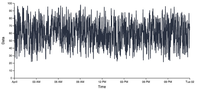
A fully embeddable javascript graph in less than 10 lines of Python- not bad.
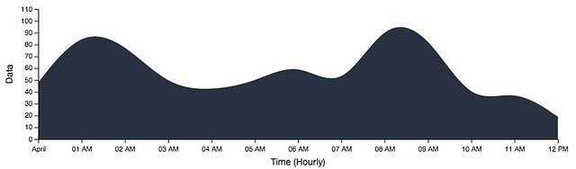
Pandas lets us perform a number of resampling operations on our data:
#Resample to hourly, which can take a lambda function in addition to the
#standard mean, max, min, etc.
half_day = series['4/1/2013 00:00:00':'4/1/2013 12:00:00']
hourly = half_day.resample('H', how=lambda x: x.mean() + random.randint(-30, 40))

#New Area plot
area = vincent.Area()
area.tabular_data(hourly, axis_time='hour')
area + ({'value': 'basis'}, 'marks', 0, 'properties', 'enter', 'interpolate')
area.update_vis(width=700)
area.axis_label(x_label='Time (Hourly)', y_label='Data')
area.to_json(path)
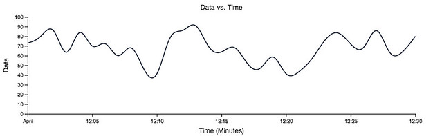
We can keep sampling to lower resolutions:
half_hour = series['4/1/2013 00:00:00':'4/1/2013 00:30:00']
vis.tabular_data(half_hour, axis_time='minute')
vis.axis_label(x_label='Time (Minutes)', title='Data vs. Time')
vis.to_json(path)
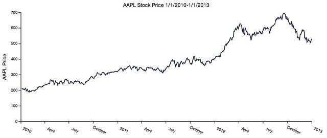
Finally, we can plot some real data using a little snippet from the Python for Data Analysis book:
import pandas.io.data as web

#All of the following import code comes from Python for Data Analysis
all_data = {}

for ticker in ['AAPL', 'GOOG']:
    all_data[ticker] = web.get_data_yahoo(ticker, '1/1/2010', '1/1/2013')

price = pd.DataFrame({tic: data['Adj Close']
                      for tic, data in all_data.iteritems()})

#Create line graph, with monthly plotting on the axes
line = vincent.Line()
line.tabular_data(price, columns=['AAPL'], axis_time='month')
line.to_json(path)

#Play with the axes labels a bit
line + ({'labels': {'angle': {'value': 25}}}, 'axes', 0, 'properties')
line + ({'value': 22}, 'axes', 0, 'properties', 'labels', 'dx')
line.update_vis(width=800, height=300)
line.axis_label(y_label='AAPL Price', title='AAPL Stock Price 1/1/2010-1/1/2013')
line.update_vis(padding={'bottom': 50, 'left': 60, 'right': 30, 'top': 30})
line.to_json(path)