Vega Axis Labeling
Tue 23 April 2013
One of the things that took me a bit of time in learning Vega was creating simple axis titles. Here is my current methodology for doing so: create custom data for each label, then reference the data with mark instances:
    "data": [
       {'name': 'x_label', 'values': [{'label': 'Time'}]},
       {'name': 'y_label', 'values': [{'label': 'AAPL Price'}]},
       {'name': 'title',
        'values': [{'label': 'AAPL Stock Price 1/1/2010-1/1/2013'}]}
      ]

    "marks": [
       {'type': 'text'
        'from': {'data': 'x_label'},
        'name': 'x_label',
        'properties': {'enter': {'align': {'value': 'center'},
          'baseline': {'value': 'middle'},
          'dy': {'value': 35},
          'fill': {'value': '#000'},
          'font': {'value': 'Helvetica Neue'},
          'fontSize': {'value': 14},
          'text': {'field': 'data.label'},
          'x': {'value': 400.0},
          'y': {'value': 300}}},
          },
       {'type': 'text'
        'from': {'data': 'y_label'},
        'name': 'y_label',
        'properties': {'enter': {'align': {'value': 'center'},
          'angle': {'value': -90},
          'baseline': {'value': 'middle'},
          'dy': {'value': -45},
          'fill': {'value': '#000'},
          'font': {'value': 'Helvetica Neue'},
          'fontSize': {'value': 14},
          'text': {'field': 'data.label'},
          'x': {'value': 0},
          'y': {'value': 150.0}}},
         },
       {'type': 'text'
        'from': {'data': 'title'},
        'name': 'title',
        'properties': {'enter': {'align': {'value': 'center'},
          'baseline': {'value': 'middle'},
          'dy': {'value': -20},
          'fill': {'value': '#000'},
          'font': {'value': 'Helvetica Neue'},
          'fontSize': {'value': 14},
          'text': {'field': 'data.label'},
          'x': {'value': 400.0},
          'y': {'value': 0}}},
          }
        ]
The x and y values on the marks are generally just half of the plot width and height, respectively. You'll need to adjust the padding a bit, but the presets above should provide relatively nice axis titles and labels:
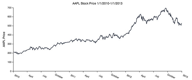
Aside: the rest of this plot, including the data pull, was generated in about 25 lines of Python with Vincent. I'm trying to make Vincent "Vega-for-Humans" as much as possible, so the syntax for generating all of the Vega specs above is:
>>>vis = vincent.Bar()
>>>vis.axis_label(x_label='Time', y_label='AAPL Price',
                  title=''AAPL Stock Price 1/1/2010-1/1/2013')