Creating and Publishing Maps with D3, Dymo, and PhantomJS
Mon 24 June 2013
Problem statement: We want to make a map with D3, automate the label placement, and publish to PDF or PNG. This is a very basic example showing how to put the pieces together- with a little polish and CSS, this workflow can create some great looking maps.
We'll get neighborhood data from Portland's Data Catalog, which comes in the Oregon State Plane coordinate system. I generally convert everything to WGS 84, particularly if there's any chance I'm going to add more layers from different coordinate systems down the road:
$ ogr2ogr -f GeoJSON \
          -t_srs EPSG:4326 \
          neighborhoods.geojson \
          Neighborhoods_pdx.shp
One small intermediate step through Python to title-case all of the neighborhood names:
import json

with open('neighborhoods.geojson', 'r') as f:
    hoods = json.load(f)

for index, feat in enumerate(hoods['features']):
    title = feat['properties']['NAME'].lower().title()
    hoods['features'][index]['properties']['NAME'] = title

with open('neighborhoods.geojson', 'w') as f:
    json.dump(hoods, f)
It's a 1.6MB file, so I'm also going to TopoJSON-ify it, keeping the 'NAME' property:
$ topojson -o neighborhoods.topo.json -p NAME -- neighborhoods.geojson
And now it's at 120.5kb. Let's get some preliminary D3 written, in order to tinker with the projection and get the data centered properly:
var width = 750,
height = 700;

var projection = d3.geo.conicConformal()
    .rotate([120.67, -45.52])
    .parallels([44, 46])
    .scale(125000)
    .center([-1.388, 0.04])
    .translate([width / 2, height / 2]);

var path = d3.geo.path()
    .projection(projection);

var svg = d3.select("body").append("svg")
    .attr("width", width)
    .attr("height", height);
Then we'll queue it up, add the labels, and see what purely centroid-centered labels look like:
queue()
.defer(d3.json, "neighborhoods.topo.json")
.await(makeMap);

function makeMap(error, hoods) {

  //For all future TopoJSON-ized data, assume we're converting it back
  //to GeoJSON using the following API call
  neighborhoods = topojson.feature(hoods, hoods.objects.neighborhoods)

  svg.append("g")
      .attr("class", "neighborhoods")
    .selectAll("path")
      .data(neighborhoods.features)
    .enter().append("path")
      .attr("d", path)

  svg.selectAll("text")
      .data(neighborhoods.features)
    .enter().append("text")
      .attr("transform", function(d) { return "translate(" + path.centroid(d) + ")"; })
      .attr("dy", ".35em")
      .text(function(d) { return d.properties.NAME; });

}
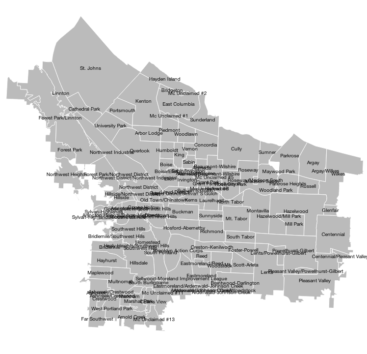
Kind of a mess. Let's get Dymo going- we'll first need to prep some input. The mapping folks at the National Park Service wrote a nice blog post about Dymo, which we'll use as an example of how to prep the data. Let's use the GDAL Python bindings to get the centroids for each neighborhood, then feed them to Dymo as our lat/lng along with some other necessary inputs:
from osgeo import ogr
import pandas as pd

hoods = ogr.Open('neighborhoods.geojson')

layer = hoods.GetLayer(iLayer=0)

lat, lng, name = [], [], []

#Get Centroids for each Polygon
count = 0
while (count < layer.GetFeatureCount()):
    try:
        feat = layer.GetNextFeature()
        centroid = feat.geometry().Centroid().GetPoint()
    except:
        count += 1
        continue
    lat.append(centroid[1])
    lng.append(centroid[0])
    name.append(feat['NAME'].lower().title())
    count += 1

#Enter parameters into Pandas DataFrame, write to CSV
df = pd.DataFrame({'latitude': lat, 'longitude': lng}, index=name)
df.index.name = 'name'
df['font size'] = 10
df['font file'] = 'fonts/helvetica.ttf'
df['point size'] = 2
df.to_csv('dymo_input.csv')
The CSV needs to be in the "data" folder in the Dymo repo, and you need to ensure that you have the correct .ttf font file in the fonts folder of the repo as well.
There are some requirements for Dymo, namely Modest Maps, Shapely, and pyproj. Pyproj is a Cython wrapper for PROJ.4, so if you're looking for projection abbrevs see here. Now cd into the Dymo repo, and set up the call to Dymo:
$ python dymo-label.py
         --projection "+proj=lcc +lat_1=44 +lat_2=46 +lat_0=45.52
         +lon_0=-120.62 +ellps=WGS84 +towgs84=0,0,0,0,0,0,0 +units=m +no_defs"
         --scale 30 --minutes 60 --labels-file labels_overlap.json
         --places-file points.json --include-overlaps
         data/dymo_input.csv
The inputs are relatively self-explanatory, and documented well on the Dymo page. First we set up the projection in Lambert Conic Conformal, with the same inputs as we're using for the D3 projection, and output to WGS84. There's some trial-and-error involved with the scale, finally settling on 40 after iterating a couple times. The model was run for 60 minutes, and outputs both the labels and points, including overlapping labels for this case. Output includes the files "points.json", which has the centroid points we fed it, and "labels_overlap.json", which contains the Dymo-ized labels.
Ok- here is a tricky bit. In the D3 docs, Mike Bostock makes the following very clear:
Important: the inside of a polygon is all points that the polygon winds around in a clockwise order. If your GeoJSON input has polygons in the wrong winding order, you must reverse them, say via ST_ForceRHR; you can also convert your GeoJSON to TopoJSON, and this will happen automatically.
There is a lesson here: when the d3 docs say something is important, pay attention. The Dymo output is in counterclockwise order, and if we don't TopoJSON-ize it, there's going to be trouble later on. Let's keep the "name" property:
$ topojson -o labels.topo.json -p name -- labels.json
Add the D3 to plot labels and points:
svg.selectAll(".symbol")
   .data(points.features)
.enter().append("path")
   .attr("class", "symbol")
   .attr("d", path.pointRadius(2));

svg.append("g")
   .attr("class", "labels")
.selectAll("path")
   .data(dymo_overlapping_labels.features)
.enter().append("path")
   .attr("d", path)
...and the result:
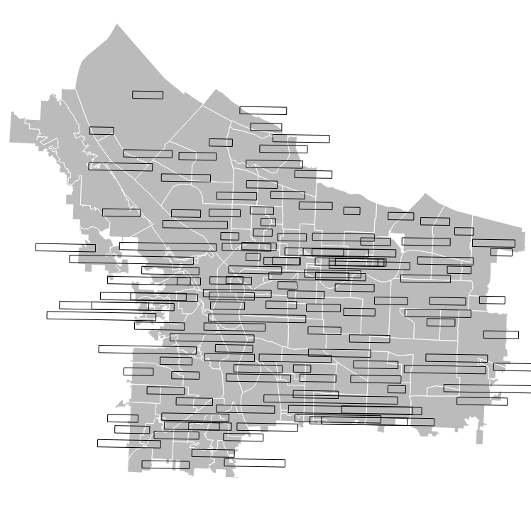
Cool! Dymo has done its best to resolve as many of the overlapping labels as it could. Unfortunately, the information density on this map is just too high- I think that even placing labels by hand we would be hard pressed to fit some of them in the map, and they would need to be moved to a legend, popover, or leading line. For the purposes of this demo, I'm going to run Dymo again without passing the "--include-overlaps" parameter, so that overlapping regions will be excluded.
With the resulting output, we're going to bind the text to the centroid of each label box that Dymo produces (and we'll get rid of the boxes themselves):
svg.selectAll("text")
   .data(dymo_labels.features)
.enter().append("text")
   .attr("transform", function(d) {return "translate(" + path.centroid(d) + ")"; })
   .attr("dy", ".35em")
   .text(function(d) { return d.properties.name; });
..and get the following:
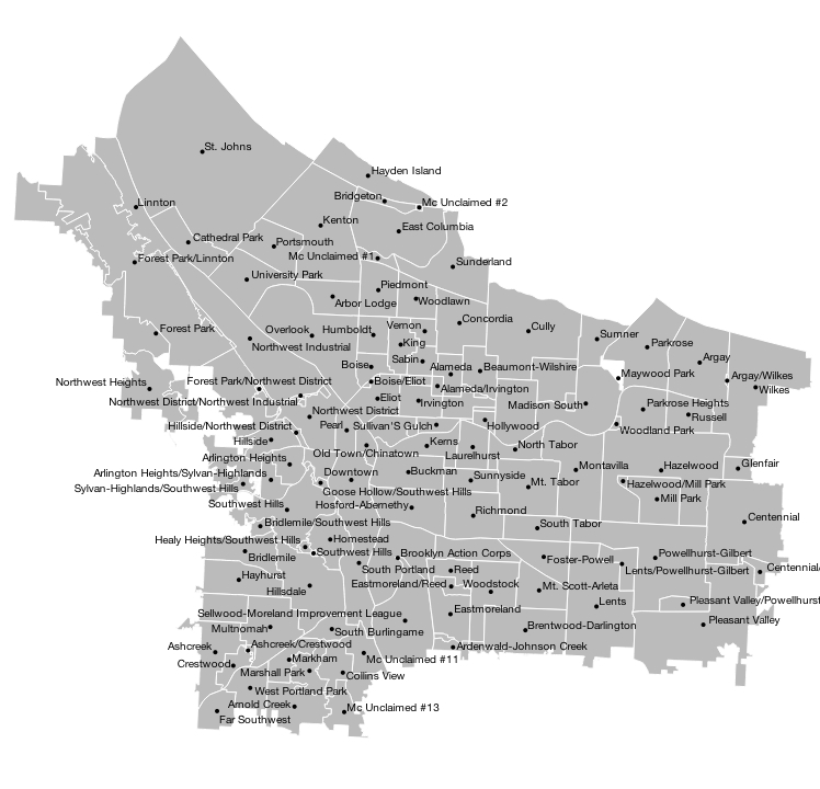
Not bad! This was a tough case- ultimately the information density is just too high for this type of map, and a different approach would be needed to include every single label (or they would have to be culled a bit). If you were curious, here is what the old (red) labels look like next to the new (black) Dymo-ized ones:
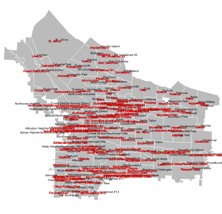
As you can see, Dymo did some nice spacing work for us in a lot of places, and eliminated all of our overlaps in the crowded interior as well.
Finally, to PhantomJS, a headless WebKit engine that can do all sorts of great things, but which I've found very useful for simply converting SVGs to PNG and PDF; this is handy for creating static assets to use in reports or presentations.
To start, I'm using the rasterize.js script included in the examples. Next, I've found that smaller fonts render best when you append a background to the SVG (if you don't want transparency as the background, that is). A quick D3 append that is CSS filled to white:
svg.append("rect")
   .attr("class", "background")
   .attr("width", width)
   .attr("height", height);
and then a one-line shell command on the map running in localhost (PhantomJS also renders to JPEG and GIF, see the docs):
$ phantomjs rasterize.js http://localhost:8000/index.html mymap.png
...and out comes a rather nice looking PNG; all of the images in this article were created using PhantomJS.
Finally, it will also produce PDFs, which will even take some paper formatting commands:
$ phantomjs rasterize.js http://localhost:8000/index.html mymap.pdf "Letter"
That's it! Some nice tools to automate label placement and export your maps to various output types. This workflow really can create some beautiful labeling, particularly on maps where you have numerous small groupings of labels that need to be separated.
I've included everything from this article, including all of the data, D3 code, and PNGs/PDFs, in its own Github repo, so feel free to take a closer look.